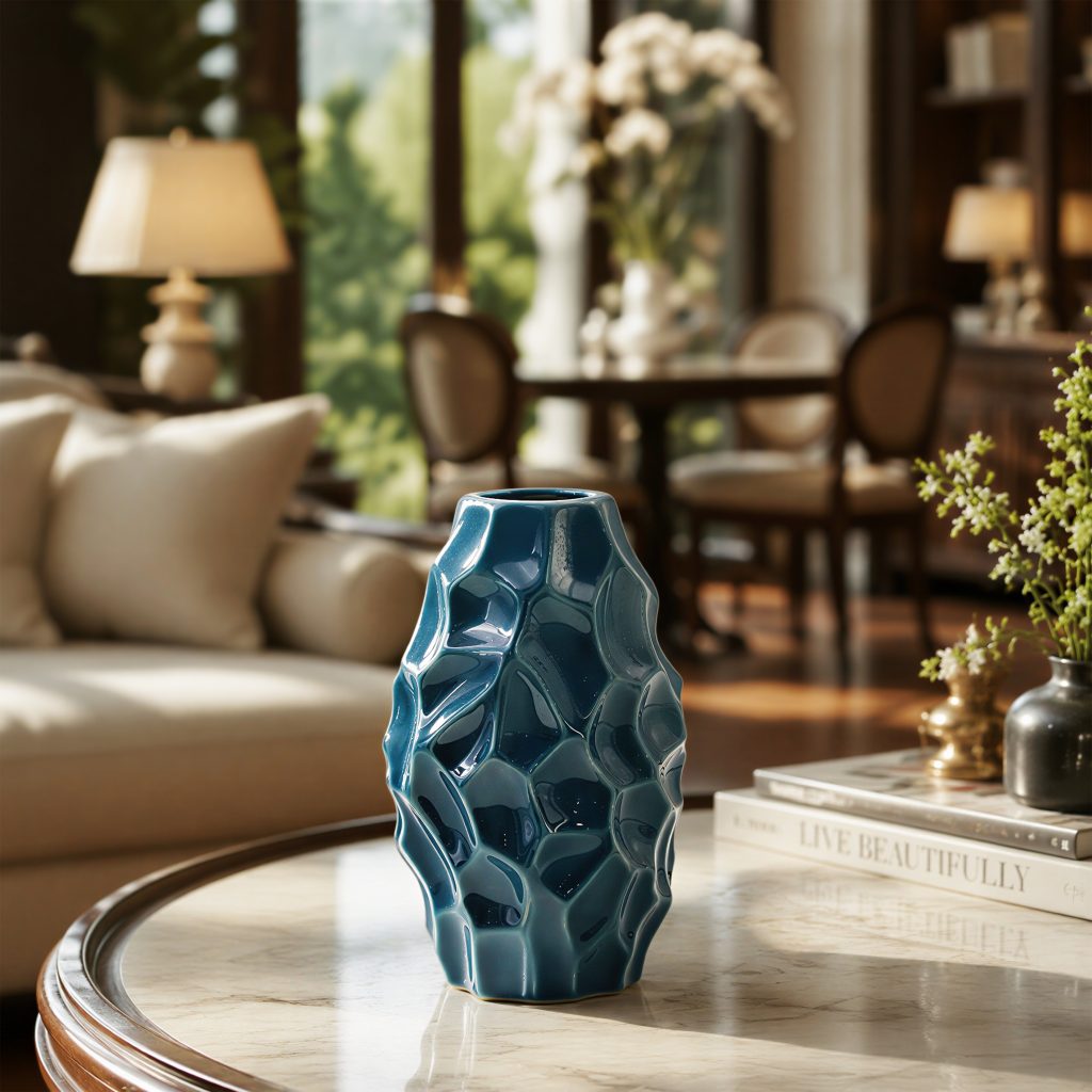
Staff on the floor do not need kiln chemistry. They need a few sentences that feel true when someone turns a vase in their hands.
Here is how we usually explain three finishes that show up often in our catalog—without the brochure language.
Crackle
Crackle is a network of fine lines in the glaze, not a crack in the clay. It softens light and ages in a gentle way. It pairs well with greenery and linen; it fights with overly glossy fixtures. For grey-green and quieter tones, start in the vase collection and compare crackle next to a smoother glaze under the same lamp.
Sand
Sand glazes read matte and a little mineral—like stone that learned manners. Fingerprints show less than on polished metallics, which shops appreciate. They are a safe “volume” finish: several pieces can sit together without looking costume-y. See how sand sits inside a series family before you commit to a deep order.
Metallic
Gold, silver, and platinum washes are accents, not wallpaper. Use them where you want a pause in the eye—an entry table, a jewelry counter edge, a single window hero. Care questions come up fast; keep the care guide bookmarked for staff.
Buying with intention
If you are unsure which finish your customers actually take home, order a small mixed carton first through trade services, then reorder the winners. For private marks or glaze tweaks, the OEM page outlines what we can usually adjust. Either way, the wholesale desk would rather hear a real shelf problem than a vague “send me everything.”